INDEX
Example 1
Failed Logon Attempts (All Users)
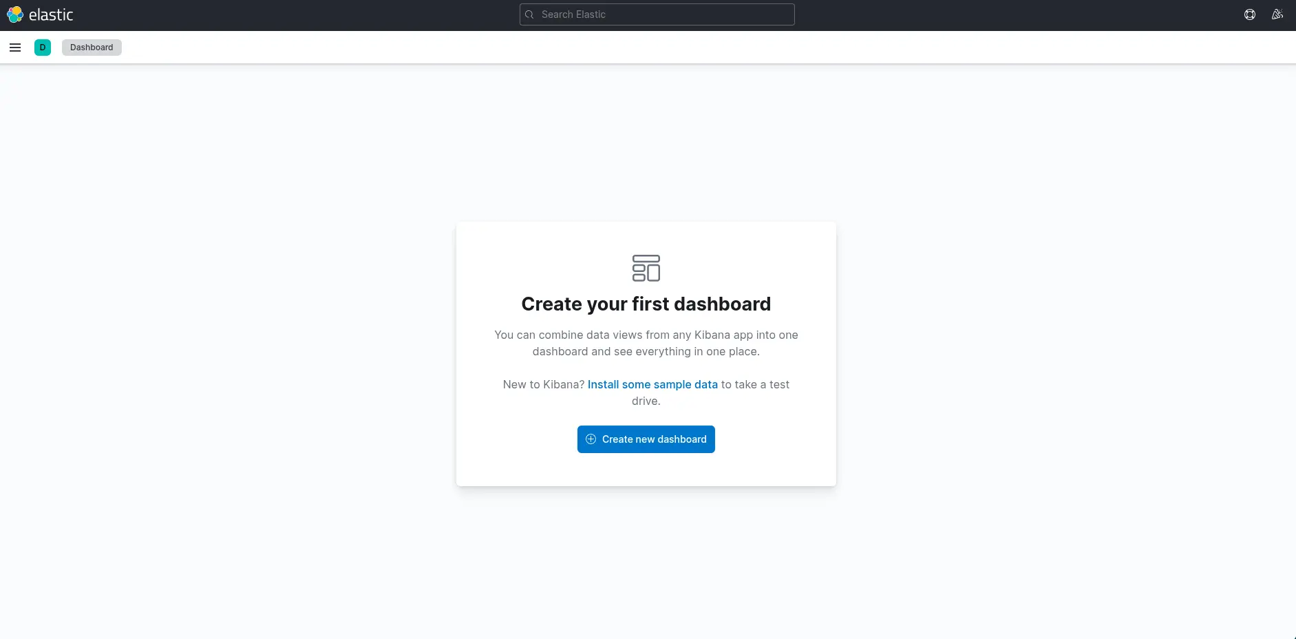
In the Dashboard page, a message will be displayed indicating that no dashboards currently exist. Additionally, an option will be available to create a new dashboard along with its first visualization. To begin, click on the "Create new dashboard" button. Subsequently, to initiate the creation of the first visualization, click on the "Create visualization" button.
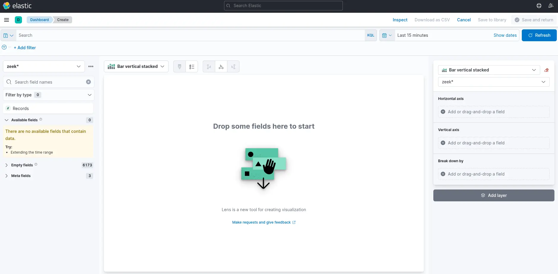
There are four things for us to notice on this window:
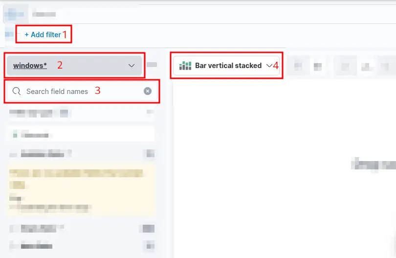
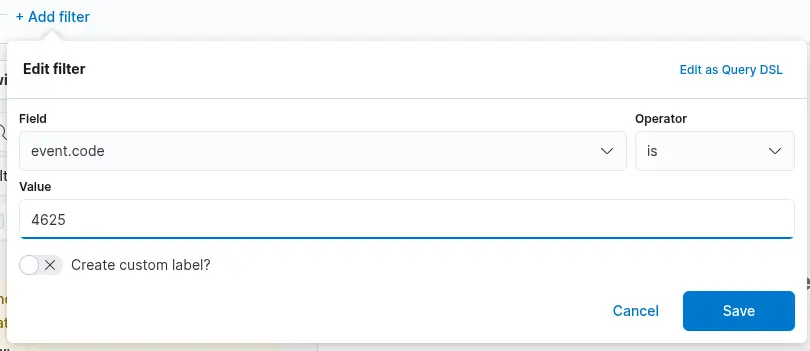
1. A filter option is available to pre-select the data before generating a graph. For instance, if the objective is to display failed logon attempts, a filter can be applied to include only events with the ID 4625, which corresponds to failed logon attempts on a Windows system. The image below illustrates how to configure this type of filter.
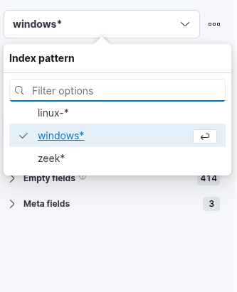
2. This field specifies the data set (index) to be used. It is common practice to organize data from various infrastructure sources into separate indices—for example, network, Windows, Linux, and so on. In this specific case, we will use windows* as the value for the Index pattern to target all relevant Windows-related data.
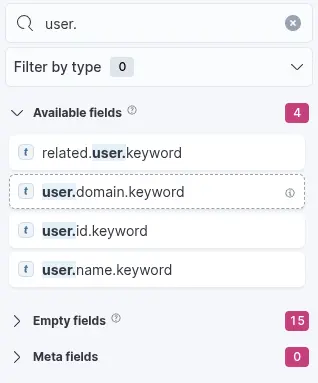
3. The search bar enables us to verify the existence of a specific field within the selected data set, serving as an additional method to ensure we are analyzing the correct data. For example, if we are interested in the field user.name.keyword, we can use the search bar to quickly check whether this field is present and indexed. This step confirms that we are accessing the appropriate field and working with accurate data. In the Elastic dashboard interface, we may apply a filter such as event.code: 4625 and then use the search bar to locate fields beginning with user., which will reveal available fields such as user.name.keyword. You might wonder: Why use user.name.keyword instead of user.name? The .keyword variant should be used when performing aggregations, as it represents the unanalyzed (exact) version of the field.
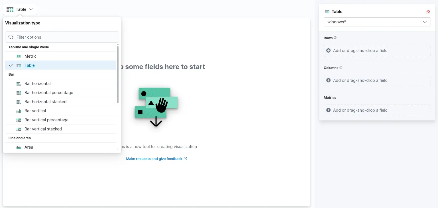
4. Finally, this drop-down menu allows us to select the desired type of visualization. By default, as shown in the earlier image, the selected option is "Bar vertical stacked". Clicking on this button reveals a list of additional visualization types (not fully shown in the image due to space constraints). From this expanded list, we can choose the visualization format that best aligns with our analytical goals and data presentation requirements. For the purposes of this visualization, we will select the "Table" option.
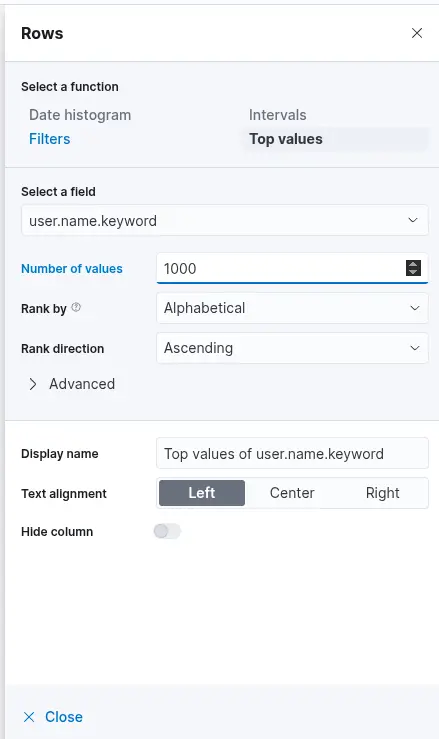
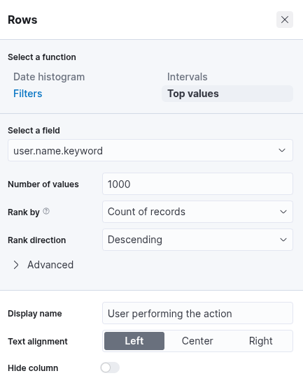
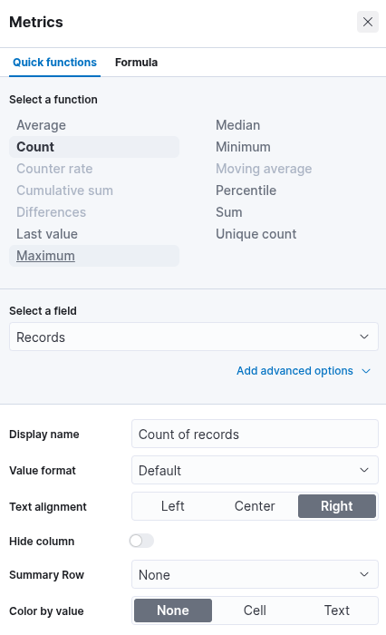
After selecting the "Table" option, proceed by clicking on "Rows". This step allows you to specify which data elements to include in the table view. Configure the "Rows" settings accordingly. At this stage, you may observe that the data is ranked alphabetically rather than by the count of records, as shown in the previous screenshot. This is expected. Once the subsequent configuration is applied, the count-based ranking will become available. Next, close the "Rows" configuration window and open the "Metrics" section. In the "Metrics" window, select "count" as the desired metric.
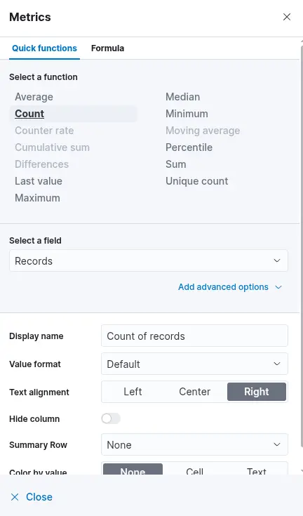
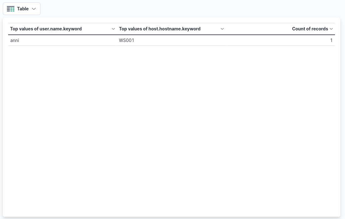
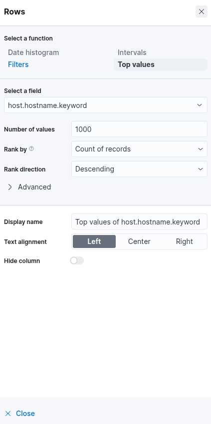
Once "count" is selected as the metric, the table will automatically populate with data—provided that relevant events are present in the selected data set. As a final enhancement, we will add an additional "Rows" setting to display the machine on which the failed logon attempt occurred. To achieve this, we will select the field host.hostname.keyword, which represents the hostname of the system that reported the failed logon attempt. Including this field enables the table to display the name of the machine alongside the count of failed logon attempts, as illustrated in the corresponding image.
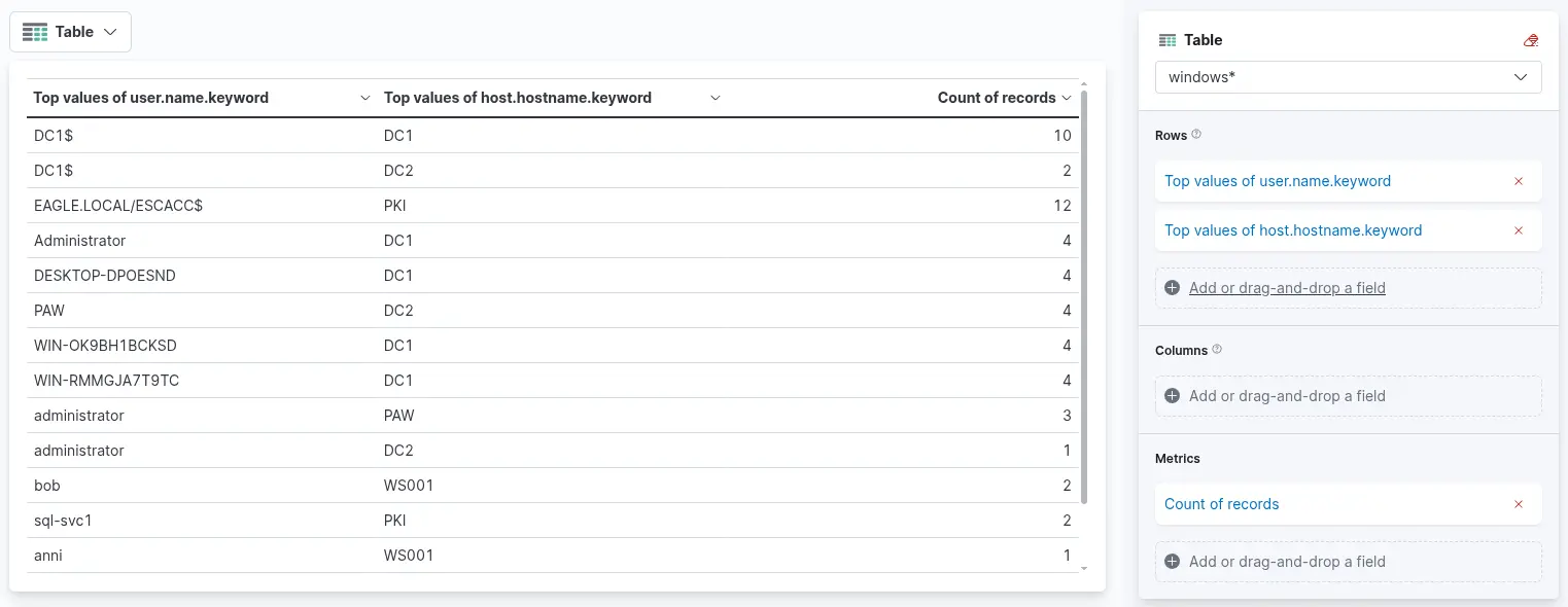
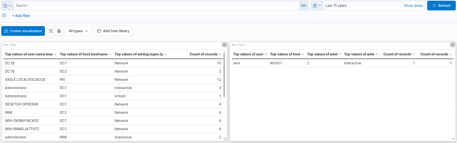
Finally, click "Save and return" to add the new visualization to the dashboard, where it will appear as shown in the following image. Remember to save the dashboard itself by clicking the "Save" button.
Example 2
Failed Logon Attempts (All Users)
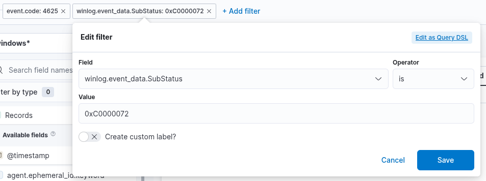
In this SIEM visualization example, our objective is to create a visualization that monitors failed login attempts against disabled user accounts. We specifically focus on failed attempts, as it is not possible to successfully authenticate using a disabled account—even when valid credentials are supplied. In such cases, Windows event logs will include an additional SubStatus code of 0xC0000072, which explicitly indicates that the login failure occurred because the account is disabled.

There are four things for us to notice on this window:
1. A filter option is available to preselect the relevant data before constructing the graph. In this case, our objective is to display failed logon attempts involving disabled user accounts only. To achieve this, we can apply a filter that includes only events with Event ID 4625, which corresponds to failed logon attempts on Windows systems—as was done in the previous visualization example. However, in this scenario, we must also consider the SubStatus field, specifically winlog.event_data.SubStatus. When this field has the value 0xC0000072, it indicates that the logon failure was caused by an attempt to authenticate with a disabled user account. The following image illustrates how such a filter can be configured.
2. This field specifies the data set (index) to be queried. In typical deployments, data from different infrastructure components—such as network devices, Windows systems, and Linux hosts—is stored in separate indices. In this example, we will use windows* as the Index pattern, which allows us to target all indices related to Windows data sources.
3. The search bar allows us to verify the presence of a specific field within the selected data set, providing an additional method to ensure that we are analyzing the correct data. As in the previous visualization, we are interested in the user.name.keyword field. By entering the field name into the search bar, we can quickly check whether it is available and indexed within the current data set. This step ensures that we are referencing the intended field and working with accurate, relevant data.
4. Lastly, this drop-down menu allows us to select the type of visualization we wish to create. The default option shown in the previous image is "Bar vertical stacked". Clicking on this menu reveals additional visualization types (not fully shown in the image due to space constraints). From the expanded list, we can choose the visualization format that best aligns with our analytical objectives and data presentation requirements.
After selecting the "Table" option, proceed by clicking on "Rows". This step allows you to specify which data elements to include in the table view. Configure the "Rows" settings accordingly. At this stage, you may observe that the data is ranked alphabetically rather than by the count of records, as shown in the previous screenshot. This is expected. Once the subsequent configuration is applied, the count-based ranking will become available. Next, close the "Rows" configuration window and open the "Metrics" section. In the "Metrics" window, select "count" as the desired metric.
Once "count" is selected as the metric, the table will automatically populate with data—provided that relevant events are present in the selected data set. As a final enhancement, we will add an additional "Rows" setting to display the machine on which the failed logon attempt occurred. To achieve this, we will select the field host.hostname.keyword, which represents the hostname of the system that reported the failed logon attempt. Including this field enables the table to display the name of the machine alongside the count of failed logon attempts, as illustrated in the corresponding image.
Finally, click "Save and return" to add the new visualization to the dashboard, where it will appear as shown in the following image. Remember to save the dashboard itself by clicking the "Save" button.
Example 3
Successful RDP Logon Related To Service Accounts
In this SIEM visualization example, our objective is to create a visualization that monitors successful RDP logons involving service accounts. Under normal circumstances in corporate or production environments, service account credentials are not intended for use in RDP logons. According to information provided by the IT Operations department, all service accounts in the environment follow a naming convention beginning with svc-.
The rationale for this visualization lies in the fact that service accounts typically have elevated or unrestricted privileges. Therefore, it is essential to closely monitor their usage to detect potential misuse or policy violations. This visualization will be constructed based on Windows Event ID 4624, which indicates that an account has successfully logged on.
There are four things for us to notice on this window:
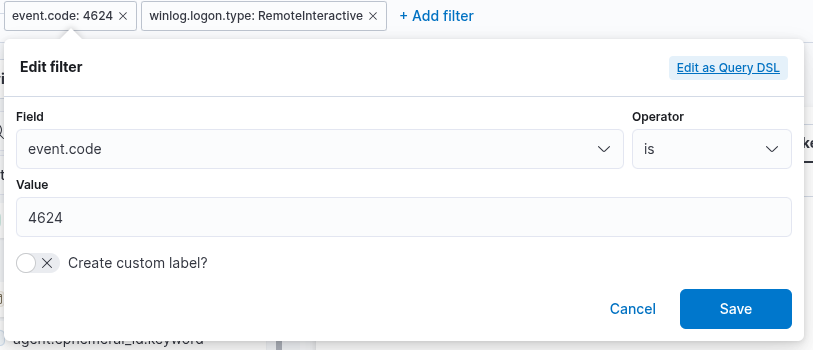
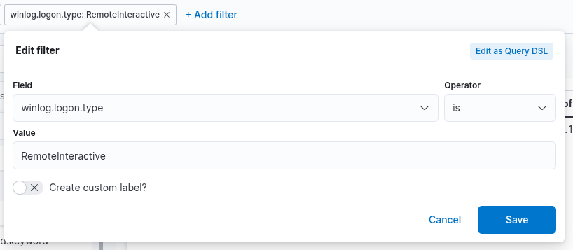
1. A filter option is available to preselect relevant data before constructing the visualization. In this case, our goal is to display successful RDP logons associated specifically with service accounts. To achieve this, we will apply a filter that includes only events with Event ID 4624, which corresponds to successful logon attempts in Windows systems. Additionally, we must filter based on the logon type, which should be RemoteInteractive. This is represented by the field winlog.logon.type with a value of RemoteInteractive, indicating a Remote Desktop logon session.
2. This field specifies the data set (index) to be queried. In typical deployments, data from different infrastructure components—such as network devices, Windows systems, and Linux hosts—is stored in separate indices. In this example, we will use windows* as the Index pattern, which allows us to target all indices related to Windows data sources.
3. The search bar allows us to verify the presence of a specific field within the selected data set, providing an additional method to ensure that we are analyzing the correct data. As in the previous visualization, we are interested in the user.name.keyword field. By entering the field name into the search bar, we can quickly check whether it is available and indexed within the current data set. This step ensures that we are referencing the intended field and working with accurate, relevant data.
4. Lastly, this drop-down menu allows us to select the type of visualization we wish to create. The default option shown in the previous image is "Bar vertical stacked". Clicking on this menu reveals additional visualization types (not fully shown in the image due to space constraints). From the expanded list, we can choose the visualization format that best aligns with our analytical objectives and data presentation requirements.
For this visualization, let's select the "Table" option. After selecting the "Table", we can proceed in the following way.
As established, the goal is to monitor successful RDP logons specifically associated with service accounts, which are known to have usernames beginning with svc-. To finalize this visualization, the following KQL (Kibana Query Language) query should be specified:
user.name: svc-*Example 4
Users Added Or Removed From A Local Group (Within A Specific Timeframe)
In this SIEM visualization example, the objective is to create a visualization that monitors user additions to and removals from the local "Administrators" group, covering the period from March 5th, 2023, to the present. This visualization will be based on the following Windows Security Event IDs:
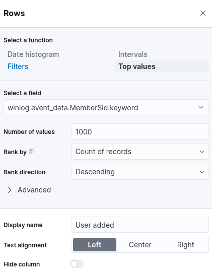
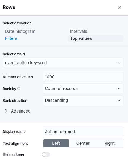
- 4732: A member was added to a security-enabled local group
- 4733: A member was removed from a security-enabled local group
There are four things for us to notice on the init window:
1. A filter option allows us to preselect relevant data before generating the
visualization.
In this case, the objective is to display user additions to and removals from the local
"Administrators" group.
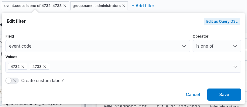
To achieve this, we can apply a filter that includes only events with
Event ID 4732 — indicating that a member was added to a security-enabled local group —
and Event ID 4733 — indicating that a member was removed from such a group.
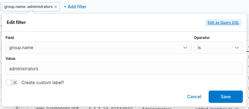
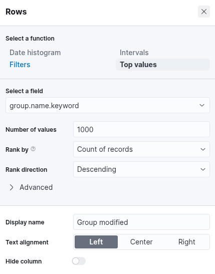
Furthermore, we can refine the filter to include only those 4732 and 4733
events where the target group is specifically the Administrators group.
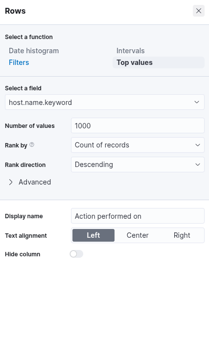
2. This field specifies the data set (index) to be queried. In typical deployments, data from different infrastructure components—such as network devices, Windows systems, and Linux hosts—is stored in separate indices. In this example, we will use windows* as the Index pattern, which allows us to target all indices related to Windows data sources.
3. The search bar allows us to verify the presence of a specific field within the selected data set, providing an additional method to ensure that we are analyzing the correct data. As in the previous visualization, we are interested in the user.name.keyword field. By entering the field name into the search bar, we can quickly check whether it is available and indexed within the current data set. This step ensures that we are referencing the intended field and working with accurate, relevant data.
4. Lastly, this drop-down menu allows us to select the type of visualization we wish to create. The default option shown in the previous image is "Bar vertical stacked". Clicking on this menu reveals additional visualization types (not fully shown in the image due to space constraints). From the expanded list, we can choose the visualization format that best aligns with our analytical objectives and data presentation requirements.
For this visualization, let's select the "Table" option. After selecting the "Table", we can proceed in the following way.
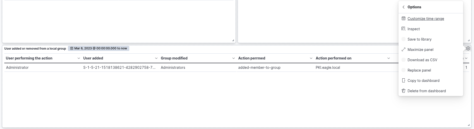
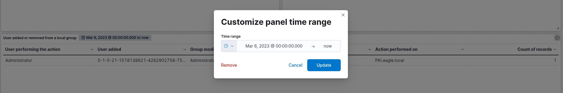
Click on "Save and return", and you will observe that the new visualization is successfully added to the dashboard. As previously discussed, the objective is to monitor user additions to and removals from the local "Administrators" group within a defined time window: from March 5th, 2023, to the present. To narrow the scope of the visualization accordingly, we must configure the time filter in the dashboard interface to reflect this specific date range. This ensures that only events occurring within the desired period are considered in the analysis.
CONTACT